Capstone build window
14 weeks
Research, design, engineering, and demo polish all had to fit into one semester.
Case Study
Case study for a 14-week capstone product that turned fragmented apprenticeship information into a guided roadmap and grounded AI assistant
Capstone build window
Research, design, engineering, and demo polish all had to fit into one semester.
Cross-functional team
4 developers and 4 designers worked in parallel, which made coordination and shared system direction important.
Dense roadmap test cases
Internal testing surfaced graph performance problems early enough to fix before the final demo.
Embedding API reduction
TTL-based query caching removed a large amount of repeated embedding work from the retrieval path.
Panday was built for BCIT ConnectHer to help trades apprentices understand where they are in the apprenticeship path, what requirements they have already completed, and what comes next without bouncing between scattered school and government resources.
This version of the case study focuses less on internal jargon and more on the process behind the product: what signals pushed the team toward a roadmap-first experience, how the design kept changing, and which engineering decisions made the final product credible.
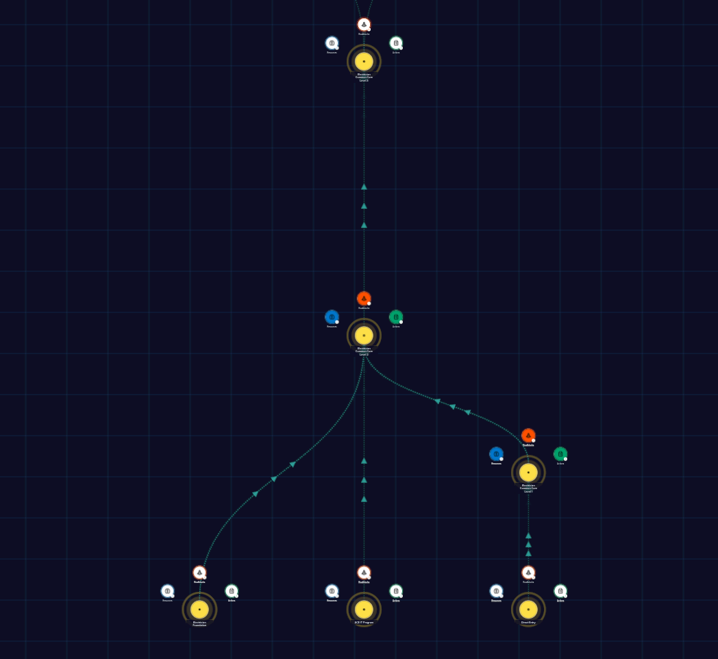
Apprenticeship requirements lived across school pages, training documents, and external resources. The problem was not total lack of information. It was the lack of a clear way to place yourself in the journey and see what mattered next.
Static pages could list requirements, but they could not show sequence, prerequisites, specialization choices, or progress in a way that felt easy to scan. The product needed to communicate structure, not only content.
Because the product touched apprenticeship guidance, the team could not rely on flashy AI alone. Any assistant layer needed visible links back to official material and had to feel like support for decision-making, not a replacement for it.
This case study works best when it explains why the product took its final shape. Each decision below uses the same structure: what problem showed up, what changed in response, and what that produced in the experience.
Problem
Users could often find isolated apprenticeship facts, but they still struggled to understand where they were in the larger path and what came next.
Decision
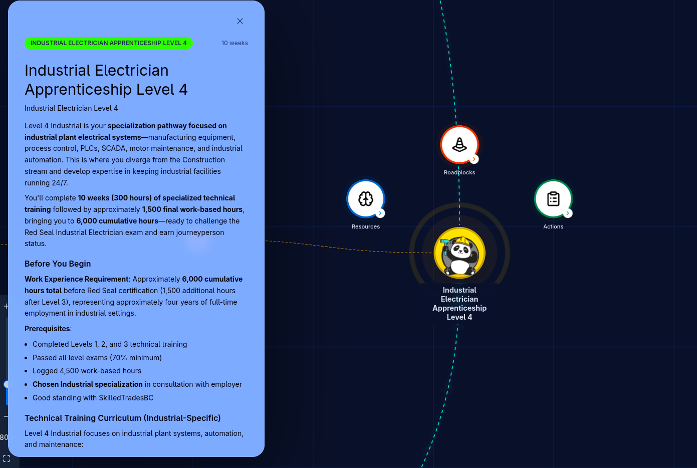
That led to a roadmap-first product and an onboarding flow that asked for current level, entry path, specialization, and residency before showing the main experience.
Outcome
The product shifted from a static information map to a guided experience that opened near the user's actual starting point.
Problem
A generic chatbot would have looked impressive, but it would not have been trustworthy enough for apprenticeship guidance.
Decision
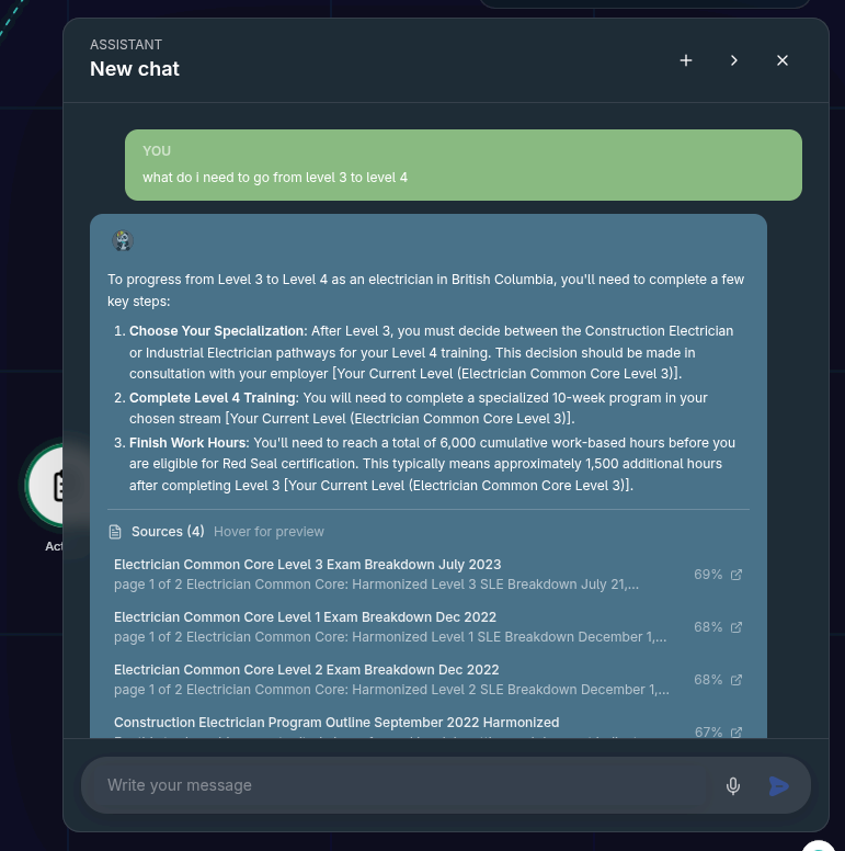
That is why the chat moved toward retrieval, citations, source previews, and bounded AI actions instead of a freeform chatbot.
Outcome
The assistant became easier to trust because answers stayed tied to documented material and risky actions stayed under human control.
Problem
As the roadmap got denser, showing every path with equal emphasis created a wall of information instead of a clear next step.
Decision
That pushed the team toward level-based centering, dimmed irrelevant branches, clearer checklist grouping, and tutorial guidance.
Outcome
The roadmap became easier to read because the interface started prioritizing where the user was and what deserved attention first.
Problem
The first usable version still had clarity problems around checklist structure, hierarchy, guidance, and information density.
Decision
The team kept revisiting the same surfaces instead of treating those issues as cosmetic polish.
Outcome
The final product felt more understandable because repeated small corrections changed the experience more than any single headline feature.
The project did not move in a straight line. It became clearer over time through a few repeated shifts in direction, each driven by a problem the earlier version had not solved well enough.
Problem
The product needed a first version that could actually represent the apprenticeship path instead of talking abstractly about it.
Decision
The team focused on getting the graph, content structure, and source material into a form the product could render consistently.
Outcome
This established the roadmap as the foundation of the experience instead of leaving it as a collection of disconnected pages.
Problem
Once the roadmap existed, it still felt too generic. Users needed the product to reflect their own entry point and current progress.
Decision
Onboarding, authentication, and account-linked positioning were added so the roadmap could open near the user's actual starting point.
Outcome
The roadmap started to feel personalized rather than informational only.
Problem
An assistant could help users ask narrower questions, but unsupported answers would have made the product feel risky.
Decision
The assistant matured through retrieval, citations, source previews, contextual prompts, and bounded AI actions instead of a looser chat experience.
Outcome
The AI layer became a support tool for understanding the roadmap rather than a separate novelty feature.
Problem
The densest parts of the experience were still hard to scan, especially for first-time users trying to understand hierarchy and next steps.
Decision
The team repeatedly reworked checklist clarity, tutorial guidance, hierarchy, information density, and trust hardening instead of assuming the first pass was enough.
Outcome
The product became clearer because the team treated confusion as a core product problem instead of a finishing detail.
The roadmap was not a single screen. It was a small system: authored content, graph generation, personalized viewport logic, grounded AI, and guardrails that kept the experience from drifting into unreliable behavior.
Roadmap copy, metadata, and graph structure lived separately so apprenticeship information could be maintained without rewriting UI code.
Loaders, caching, and graph-generation logic turned authored content into a structure the product could render and update consistently.
Onboarding and progress state centered the roadmap near the user's level, dimmed less relevant paths, and made the graph feel guided instead of static.
Chat retrieved from roadmap content, streamed answers, and surfaced citations so users could follow the reasoning back to source material.
Validation, rate limiting, sanitization, and approval-based AI actions kept the experience safer under real use.
The biggest product problem was not the lack of information. It was helping users understand where to start and what mattered next. That changed how I thought about the job of the interface.
The strongest assistant decisions were not the most ambitious ones. Citations, bounded actions, and clear source relationships did more for credibility than making the chat feel more autonomous.
The final product came from repeated small corrections around hierarchy, guidance, and cognitive load. Those changes were not cosmetic. They were what made the experience understandable.
Problem
The roadmap could not rely on fixed node positions because progress paths, node states, and custom additions all needed room to evolve.
Decision
The frontend used React Flow for interaction and D3-assisted layout work for placement, while the content model separated copy, metadata, and graph structure so authoring stayed content-driven.
Impact
That made it possible to support denser graphs without collapsing into brittle hand-positioned layouts or unreadable visual noise.
Problem
Generic model output would not be credible for apprenticeship guidance, especially when users needed answers tied to official material.
Decision
The chat flow used retrieval over apprenticeship content with pgvector-backed search, source-aware responses, validation, and user-scoped persistence instead of unsupported improvisation.
Impact
That structure increased trust, improved answer quality, and gave the assistant a stronger relationship to the roadmap itself.
Problem
Graph interaction and team velocity both became risks as the roadmap got denser and more contributors landed changes in parallel.
Decision
Performance bottlenecks in dense graphs were fixed before launch, Redis caching and buffering protected repeated work, and a Go reverse proxy kept local and production routing consistent without application-code changes.
Impact
The product stayed responsive during internal testing and the team could keep shipping without destabilizing the late-stage demo build.
Cost and latency
~80% reduction in embedding API calls through TTL-based query caching on repeated retrieval paths.
Graph responsiveness
Responsive interaction retained during internal testing with 100+ node scenarios after performance fixes.
Delivery confidence
Production-oriented quality signals added across rate limiting, validation, logging, health checks, and CI coverage.
Process clarity
Ticket history made the iterations visible: the product repeatedly circled back to onboarding, hierarchy, clarity, and trust as new problems surfaced.